
Last updated: October 30, 2026
Quick Answer: Use 2 to 3 colors, 1 frame style, and 1 clear focal shape to make paper wall art feel finished instead of crafty. Paper wall art is one of the easiest ways to make a blank wall feel finished without buying heavy decor or committing to expensive pieces. The trick is to treat it like real wall art: choose a strong shape, use good stock, and frame or mount it cleanly so it reads as intentional instead of craft-store clutter; if you are unsure about materials or mounting, consult a framing or conservation professional, since standard framing guidance emphasizes stable support and safe display conditions.
Key Takeaways
- Simple wall art made from cardstock can look polished when the shapes are large, calm, and repeated.
- Frames do most of the finishing work, especially for cut paper art and layered compositions.
- A craft knife gives cleaner edges than scissors when the design includes tight corners or interior cuts.
- Adhesive dots help create depth, but too many can make a piece bulge or shadow badly.
- Template paper is useful when you want a symmetrical design without redrawing it three times.
- A restrained palette often works well: one color family, one frame style, and one clear focal point.
What counts as paper wall art, and why it works in a real room
Paper wall art is a finished decorative piece made from cut, folded, layered, or mounted paper that is meant to stay on display, not end up in a classroom folder. It works because paper can mimic the clean lines of a print, the texture of relief art, and the rhythm of sculpture, all at a low material cost.
Because of that flexibility, paper wall art can also stay calm in a room where heavier decor would feel crowded. A framed sheet of cream cardstock with a single abstract cut can look calmer than a busy poster. A stack of 2 or 3 matte layers can create depth without the weight of wood or metal. If the wall already has a sofa, shelf, or headboard, paper gives you a way to echo those lines without crowding the space.
This is also where many generic articles go wrong: they treat every paper project as temporary or kid-focused. That misses the point. A finished wall piece needs sturdier stock, accurate cuts, and a mounting method that survives the shift from worktable to wall. Standard printer paper wrinkles too easily for most display work. Cardstock in the 65 to 110 lb range is a safer starting point for shapes that need to hold up inside a frame, though if the piece will be large, layered, or unusually delicate, consult a professional framer about the best support.
Paper wall art is not the right choice if you want outdoor decor, very high humidity resistance, or a texture that can take direct handling. It is also not ideal for ultra-dark walls unless you use strong contrast and a frame that helps the piece “float” visually. For most living rooms, bedrooms, hallways, and entryways, though, it is one of the cleanest low-cost decor moves available.
Framed paper art ideas that look polished, not crafty
Framed paper art is the easiest route if the goal is simple home decor, because the frame supplies the structure and makes even a minimal design feel finished. A standard 8×10, 11×14, or 16×20 frame is enough for most ideas here, and the glass or acrylic front helps flatten the composition. According to the U.S. General Services Administration, keeping wall art centered at about eye level is a common display guideline, which usually places the visual center around 57 to 60 inches from the floor.
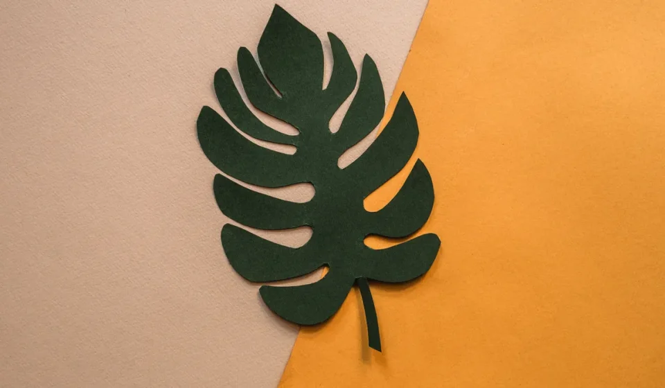
Start with a single bold shape. A square of black cardstock with one circular cutout can look modern in a white frame. A pale background with a centered leaf silhouette feels calmer and more traditional. A short phrase can work too, but only if the lettering is crisp and the spacing is generous. Busy script is where a lot of home projects slide into looking homemade in the wrong way.
A useful rule: the more detailed the cut, the simpler the color palette should be. One color on one background keeps the piece readable from across the room. If you want more movement, use two or three sheets and let the frame do the rest.
A few framed directions that work well:
- an all-white relief composition on white mat board for a tone-on-tone effect
- a black geometric cut on cream cardstock for a high-contrast modern look
- a layered botanical silhouette with 2 or 3 stacked colors
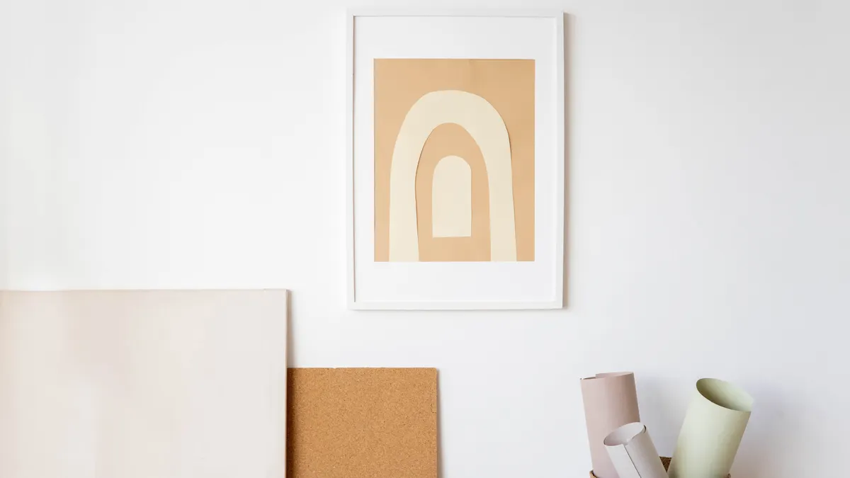
- a centered abstract circle or arch that echoes current contemporary decor shapes
The trade-off with framed work is depth. A piece with multiple layers may need a deeper frame or a spacer so the glass does not flatten the raised areas. If the design has a shadow-box feel, choose the frame first and build to its interior depth instead of forcing a flat frame to hold too much volume. For more framing basics, the Nielsen Bainbridge framing guide and museum conservation advice from the Smithsonian both stress proper support and spacing for delicate works.
How do you make paper wall art?
You make paper wall art by choosing a simple design, cutting it cleanly, mounting it on a backing, and framing or hanging it so the final piece looks intentional. The process is straightforward, but accuracy matters more than speed, especially once you use a craft knife or start layering.
- Pick one wall and one size first. A 12 x 16 inch piece reads differently from a 5 x 7 accent, and the room should tell you which scale belongs there.
- Choose a design with one clear shape. Start with an arch, leaf, circle, abstract line, or symmetrical cut rather than a complicated scene.
- Transfer the pattern to template paper. Template paper makes tracing easier and helps you test the layout before cutting into the final cardstock.
- Cut on a self-healing mat with a craft knife. A sharp blade gives smoother curves and cleaner inner corners than scissors.
- Mount the cut piece on contrasting stock or a mat. A 1/8 to 1/4 inch border is usually enough to frame the shape without crowding it.
- Use adhesive dots or thin foam mounts for layered depth. Even small lifts create shadow and make the piece feel more dimensional.
- Place it in a frame or shadow box. A snug fit can help keep the edges straight and reduce the risk of warping over time, though for large or fragile pieces a professional framer can recommend the best support.
- Hang it at eye level for the room. In most homes, that means centering the art around the visual line of the furniture, not the ceiling.
The result is usually strongest when the cuts are clean, the margins are even, and the paper stock is heavy enough to hold its shape. If the piece looks flat, add depth with a second layer. If it looks busy, remove color before you add more shape. For hanging references, see the GSA’s wall-art placement guidance and conservation notes from major museums such as the Smithsonian.
Modern paper wall art ideas for clean rooms
Modern paper designs work best when the form is simpler than the medium. That means large negative space, limited color, and shapes that feel architectural rather than decorative for decoration’s sake. A room with a gray sofa, oak shelf, or plain headboard usually benefits from a piece that echoes those lines instead of competing with them.
A good starting point is a stacked arch. Cut the same arch in two shades of cardstock and offset the top layer by a few millimeters so the shadow line becomes the design. Another strong option is a grid of 4 small abstract panels, each with one repeated shape in a different orientation. That gives you rhythm without visual noise.
A few modern directions to consider:
- oversized circles in matte black, sand, or charcoal
- thin-line botanical silhouettes with lots of open background
- layered rectangles that create a subtle brutalist feel
- one large organic cut in warm neutrals for a softer contemporary look
- repeated half-moon shapes arranged in a simple vertical line
The point is not to make the piece look expensive. It is to make it look deliberate. That means no glitter, no mixed paper weights, and no color combination that fights the rest of the room. Two colors are usually enough. Three is the upper limit for a piece that should feel calm.
This style is also the most forgiving for renters and small spaces. It can sit above a console table, inside a bookshelf niche, or between windows where framed art often feels too heavy. If the wall is narrow, choose a vertical design. If the wall is wide and low, use a horizontal layout and keep the composition sparse. For room-scale planning, the Aesthetic Archive guide to balanced wall arrangements offers a useful visual reference.
Layering paper without making it look bulky
Paper layering works when the shadows are part of the design, not an accident. The cleanest layered pieces use 2 or 3 layers, not 6 or 7, because too many layers quickly create puffiness and uneven edges under a frame.
The easiest method is to cut a base shape from heavier cardstock, then add a second shape on top with adhesive dots placed near the edges and center. A third layer should be smaller and more restrained, such as a highlight in a lighter tone or a shadow in a darker one. If the piece is botanical, let the top layer define the leaf vein or flower center. If it is geometric, let the layers create offset borders.
A few practical rules keep the result tidy:
- keep the same paper weight across visible layers when possible
- use a bone folder or ruler edge for crisp creases if you fold any section
- space adhesive dots evenly so one corner does not lift higher than the others
- avoid glossy stock unless the room already has a high-shine finish
Layering can fail in two common ways. First, too much height makes the art bump into the glass, which flattens it unevenly and can warp the paper. Second, mismatched colors can make the layers look accidental rather than designed. If the palette is soft, stay within one family: cream, oatmeal, taupe, or muted gray. If you want contrast, keep it strong and simple, like black on white with one accent layer.
Layered work is a strong fit for entryways, bedrooms, and offices because it adds interest without competing with furniture. It is less suitable for cramped frames with shallow depth or walls that already carry a lot of pattern. In those cases, a flat cut piece is the cleaner choice. For help comparing wall finishes and visual density, the Smithsonian’s conservation resources are a reliable starting point.
Cut paper art that reads like decor, not a school project
Cut paper art becomes decor when the cut pattern is restrained and the negative space is doing real work. The mistake most people make is filling every inch of the sheet. That turns the design into lace-like clutter instead of a focal point.
The better approach is to think in silhouettes. One large cut leaf, one mountain line, one repeated curve, or one symmetrical medallion can carry a whole piece. If the shape has internal cutouts, keep them few and well spaced. Tight clusters of tiny holes are where handmade work starts to look fragile.
A craft knife is the right tool for most serious cut work because it handles interior detail more cleanly than scissors. A fresh blade matters more than force. If the knife has to be pressed hard, the edge usually tears instead of slicing. Use a metal ruler for straight cuts, a mat for protection, and template paper for the pattern before moving to final stock.
The most successful cut paper art often uses a single sheet against a darker backing. That gives the edges definition and lets the shadows carry the texture. If the wall color is pale, reverse the contrast: dark cutout on light backing, or a white piece in a black frame.
This is the one style that can look too delicate if scaled down too much. A 4 x 6 inch cut may disappear once it hangs on the wall. For most rooms, aim larger than you think you need. A 12 x 12 or 11 x 14 format gives the cut room to breathe and keeps the details legible from a few feet away. The same principle appears in museum display guidance, where scale and viewing distance matter as much as the object itself.
Common mistakes that make paper decor look cheap
Cheap-looking wall art usually comes from small execution errors, not from the material itself. The biggest mistake is using flimsy stock. Regular copy paper wrinkles, sags, and shows every bump under a frame. A second mistake is cutting without a plan, which leaves uneven margins and crooked symmetry that the eye catches immediately.
Another problem is overdecorating the piece. Too many colors, too many layers, or too many tiny cuts can make the composition feel busy in a way that a living room wall almost never needs. Home decor usually wants fewer decisions, not more. A single strong shape in 2 colors often looks better than a complicated scene in 5.
Mounting errors are just as visible. If adhesive dots are placed unevenly, one side of the piece can shadow more than the other. If the art is too close to the frame edge, it feels cramped. If it floats in the middle of a large mat with no visual anchor, it can look lost. These are layout problems, not craft problems, and they are easier to fix before hanging than after.
A few quick corrections help:
- replace copy paper with cardstock in a heavier weight
- use a ruler and cutting mat for straight edges
- leave enough border space so the composition can breathe
- keep the frame style simple when the art itself is detailed
This approach is not for someone who wants one-minute wall filler. It is for a reader who wants the wall to look considered, even if the project itself is simple. For broader inspiration across styles and materials, the paper craft ideas hub can help connect this to other rooms and formats. If you want to compare your options, a simple wall art guide can also help you decide when paper is enough and when a different medium makes more sense.
How do you make paper wall art?
You make paper wall art by cutting or layering a design on heavier stock, mounting it neatly, and framing it for display. A simple shape, clean edges, and a stable backing matter more than complexity. Start with cardstock, use a craft knife for detail, and keep the palette limited so the final piece looks intentional.
What paper crafts look good in frames?
Framed work looks best when it has strong silhouettes, clean margins, and a limited color palette. Cut paper art, layered abstract shapes, simple botanical forms, and geometric compositions all frame well. Pieces with 2 or 3 layers usually hold up better visually than crowded designs with many tiny elements.
How can i decorate a wall with paper?
I can decorate a wall with paper by using framed pieces, grouped mini prints, or layered cut designs that fit the room’s scale. The safest route is one or three coordinated frames rather than scattered singles. For a tidy result, use cardstock, choose one color family, and hang the art at a consistent height.
Drafted with AI; not yet reviewed by a person.